AI Ching website
A calmer way into the Book of Changes.
Free I Ching readings, a complete hexagram library and practical guides. A website that connects the moment of asking a question with the space to explore its meaning.
Product design · Web development · Content structure · Technical SEO
The starting point
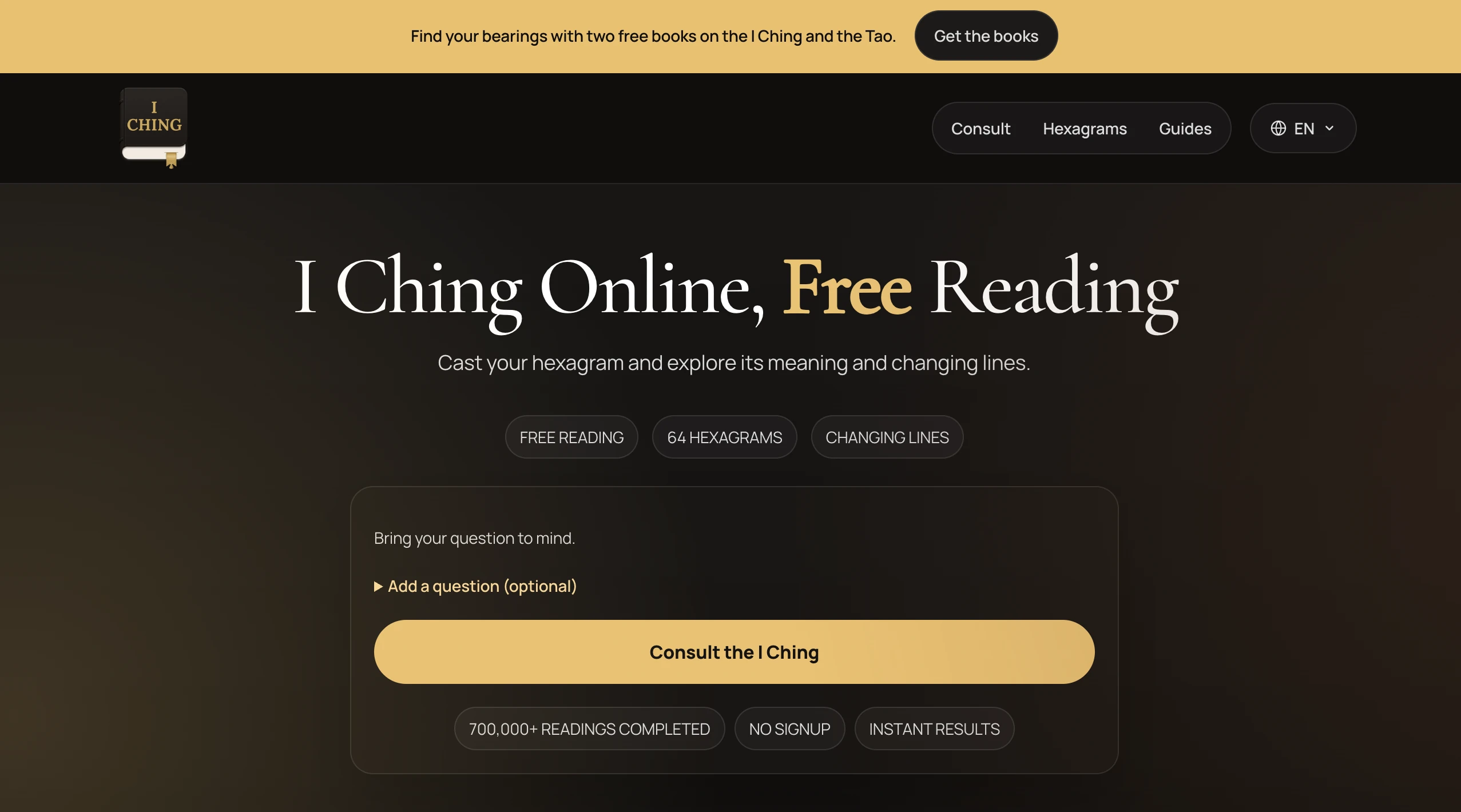
A personal practice, opened to the web.
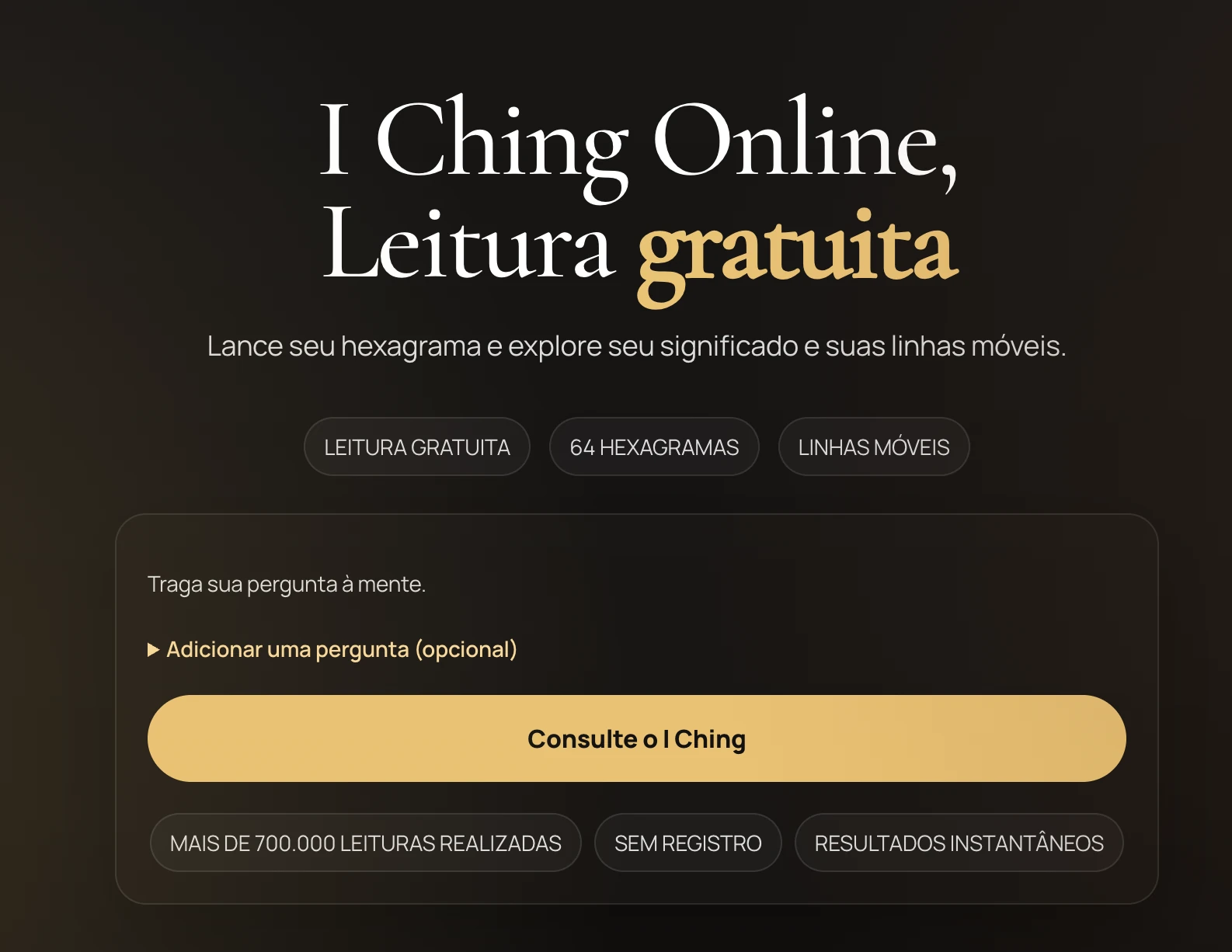
AI Ching grew from my years of collecting I Ching translations. I built the website around a clear demand from people looking for I Ching readings online. It gives them a direct way to consult and explore in their browser.
The experience accommodates different starting points. Some visitors have a question in mind. Others already know a hexagram, or need an introduction to the I Ching before beginning.
The reading experience
From a question to a hexagram.
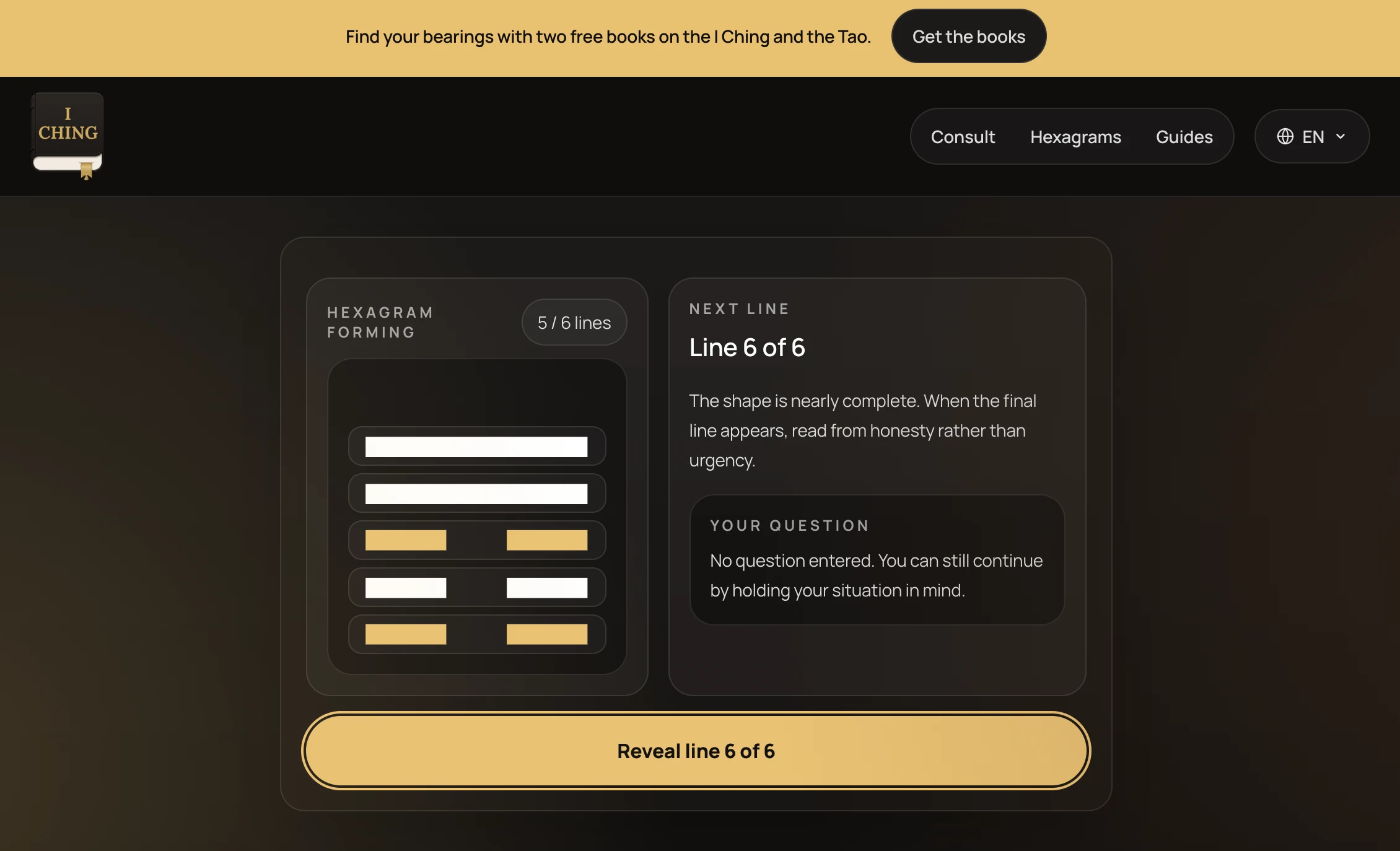
The guided reading builds a hexagram line by line. A question is optional, so someone can hold a situation in mind and continue without having to write it down.
The reading leads into the hexagram, changing lines and related material. The intention is to make the next step understandable while leaving room to read slowly.
Content and discovery
Build paths into a substantial library.
The site connects the 64 hexagrams with changing-line guidance and practical introductions. Visitors can enter through the guided oracle, the library or a guide explaining the method.
Each entry point needs a useful next step, whether that leads from a guide to a reading or from a hexagram to its changing lines and related material. That structure gives the library depth without asking every visitor to begin in the same place.
Audience-led localisation
Follow the people already arriving.
PostHog helped me see that people were finding the site from Spanish-speaking countries. That changed the question from which language I might add to how I could make the experience more useful to an audience already there.
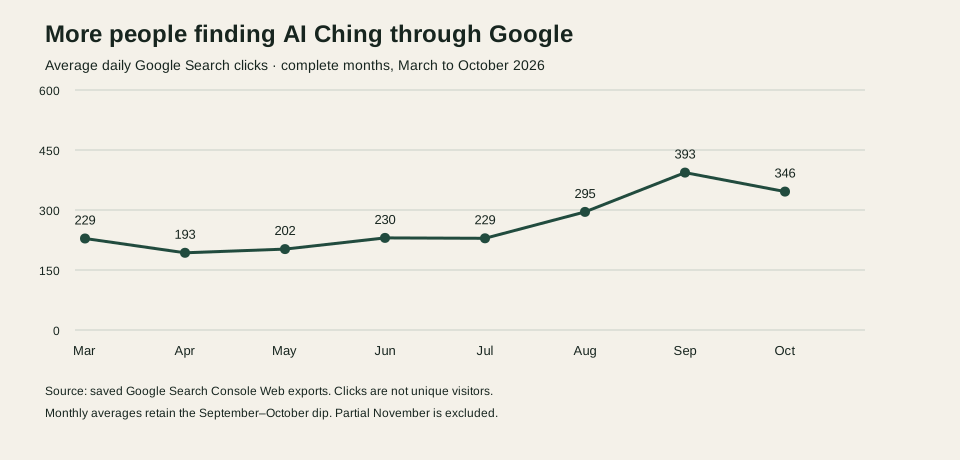
Spanish came first, followed by Brazilian Portuguese. I saw traffic increase after those translations. The search chart below shows the broader trend. The product decision was to use observed audience behaviour to guide where I invested the work; the chart alone does not isolate the effect of translation.
A connected experience
Carry the language through the journey.
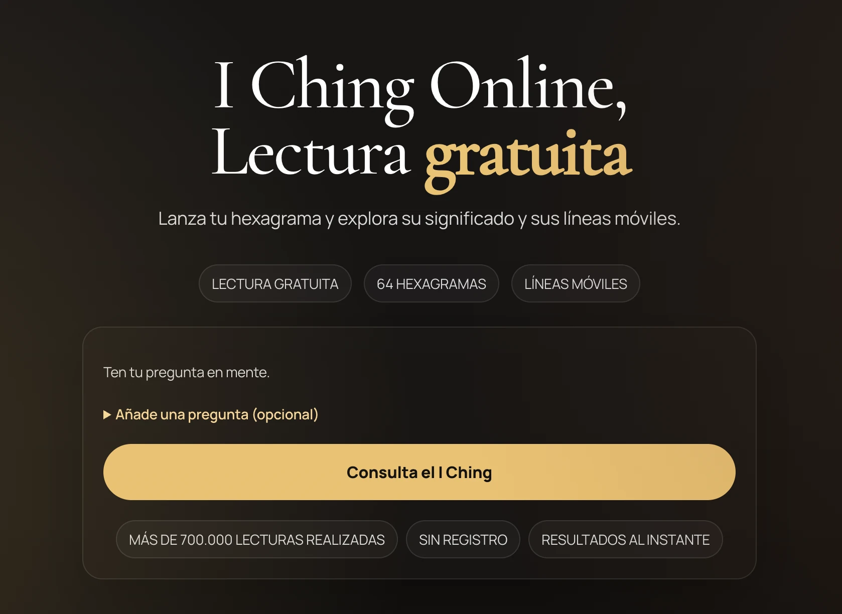
The work extends beyond translating a headline. The invitation to ask a question, the casting instructions, the interpretation and the routes between related pages all need to make sense together.
Brazilian Portuguese builds on the same underlying experience while giving it its own language routes and interface wording. Canonical URLs, language alternatives and page-specific metadata help connect the editions without treating them as interchangeable copies.
Search and optimisation
Make the useful material discoverable.
Search is part of the product work. Clear page purposes, descriptive titles, structured data, canonical URLs and language alternatives all support the content. The website source brings those foundations together with the reading interface.
The work connects content and implementation. A useful guide needs a clear route into the reading experience, and a reading needs a useful route into deeper explanation. That relationship shapes both the navigation and the search foundations.
Search visibility over time
A growing audience, with room to improve.
Growth in average daily Google Search clicks
March to October 2026 · 229 → 346 clicks a day
Saved Google Search Console exports show average daily search clicks rising from about 229 in March 2026 to 346 in October, an increase of approximately 51%. September averaged 393 clicks a day, so the longer-term growth includes a decline into October.
These are clicks from Google Web Search, not unique visitors or completed readings. The chart uses complete calendar months and averages daily clicks within each month. It shows the direction of search discovery without attributing every change to one release or translation.
Two ways to explore
The website and the app have their own roles.
The website offers the same core reading experience as the mobile app, directly in the browser. The app adds journaling and a companion you can carry with you. Further app features are being developed to give people more reasons to download it and support its paid offering.
I designed and built both experiences. The app has its own portfolio story, with real phone screenshots and the background to the collection that started it.
Have a build that needs to work better?
I bring the same care to the products I help other people get over the line. I work to understand the real workflow, simplify the difficult steps and carry the design through implementation.